Hey there cndcc!
Apologies for the late response and thank you very much for the ideas!
So.
First of all, I would like to note that developers are aware of the problem with very wide Sitemaps and all the consequences that are coming from it. Like, problems with export, for example. We’ll make some changes and upgrades.
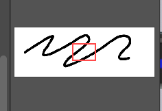
Well, you can export — but the image is literally too wide for the native Mac image previewer to view the image. You get a mini blue screen of death in Image Preview (see below). You also can’t import it into Photoshop/Illustrator at that point to then convert it into a PDF for a client because it’s simply too wide of an image, so those options aren’t even available.
Hmm, what is the size of such a file? Did you try to export in SVG? What are the results?
Disorientation in navigating: When you collapse a LARGE branch in the sitemap, you lose your place in the sitemap
Makes total sense.
We think it’s a great solution for the problem to have a navigator pane like in PS/Miro.
Added to the backlog!
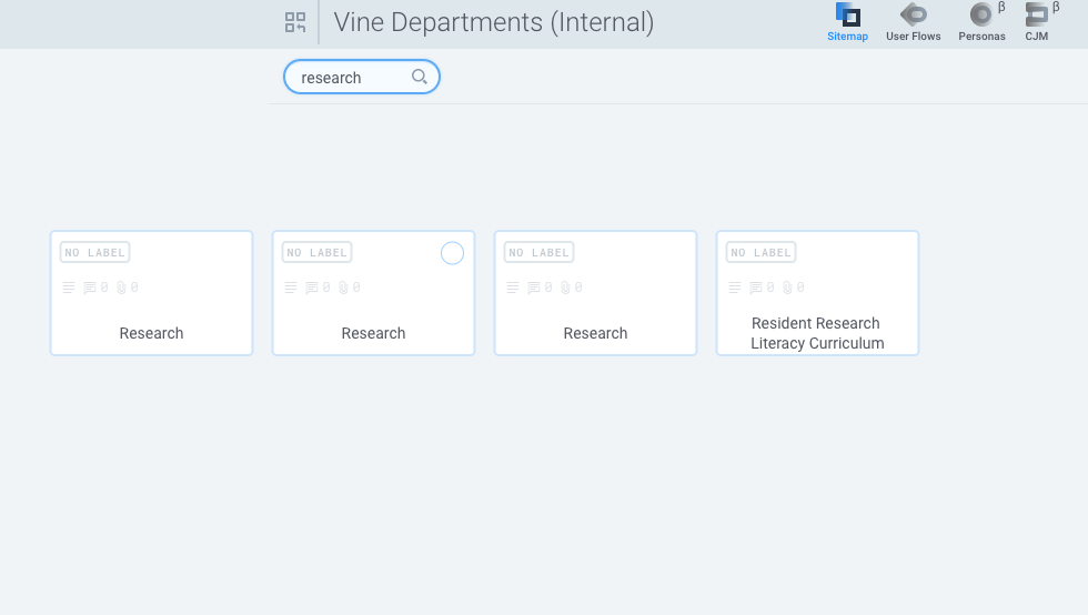
In large sitemaps, where you have difficulty searching for a certain card/page, the search is practically useless if you want to know where in the sitemap it is.
Makes total sense [2], but this time we actually discussed this before! It was before we decide to add Personas and CJM and eventually, it goes into “for the future” folder 
I understand a lot of sitemaps aren’t this extraordinarily wide, but coming from a user experience background, the consideration and testing of edge cases are just as important as main use cases (small sitemaps).
We absolutely agree. Our goal is to create flexible tools that work fine and provide a good user experience no matter what your requirements are.
The main obstacle here is the harsh reality - FlowMapp is the small team of enthusiasts. We just don’t have enough resources to make everything we want asap - we have to choose and plan.
I can’t tell you how many times these issues have frustrated us.
Very excited that the helicopter view feature will be released soon, and looking forward to it! However, we hope that you can resolve these issues in your app.
Sorry about this. You have no idea how grateful we are for such detailed feedback and your - participation, you obviously spend so much time creating this post 
Please check your PM!